Independent visual artist, Germany (remote collaboration)
Build From Scratch
The Brief
Felicitas Butt is a visual artist working across several disciplines from Germany, without gallery representation. Her site now carries the whole practice — work, workshops, rentals, exhibitions and a shop — laid out so the artwork leads and the design complements it rather than competing for attention. Built in Webflow so she publishes herself, and used to support applications for public arts funding.
The Situation
An artist without a gallery carries the gallery’s jobs herself. Felicitas needed a site that could do two things at once: show a multidisciplinary practice clearly enough that a visitor understands it is one artist rather than several, and stand up as evidence in applications for German public arts funding.
Multidiscipline is the hard part. Painting, textile work, sculpture and photography do not share a visual language, and a site organised around the disciplines fractures into unrelated rooms. Organised too loosely, nothing is findable.
There were also revenue lines with nowhere to live. Workshops, studio rentals and an eventual shop each needed a home in the structure from the start, not bolted on once traffic arrived.
And whatever we built, she had to be able to run it. A site that needed a developer for every new body of work would have become a cost rather than an asset.
What We Did
The people using it
A visitor arriving from an exhibition listing needs to see the work first, and to understand within a screen that these disciplines belong to one practice. That understanding is what the whole structure exists to produce.
A funding assessor reads differently. They need the practice to look established, consistent and documented — which is why exhibitions and the about page carry as much structural weight as the galleries do.
Felicitas needed to add a body of work, list a workshop or open the shop on her own schedule. Every structural decision was tested against whether she could maintain it alone.
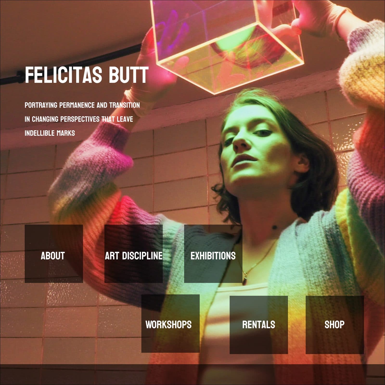
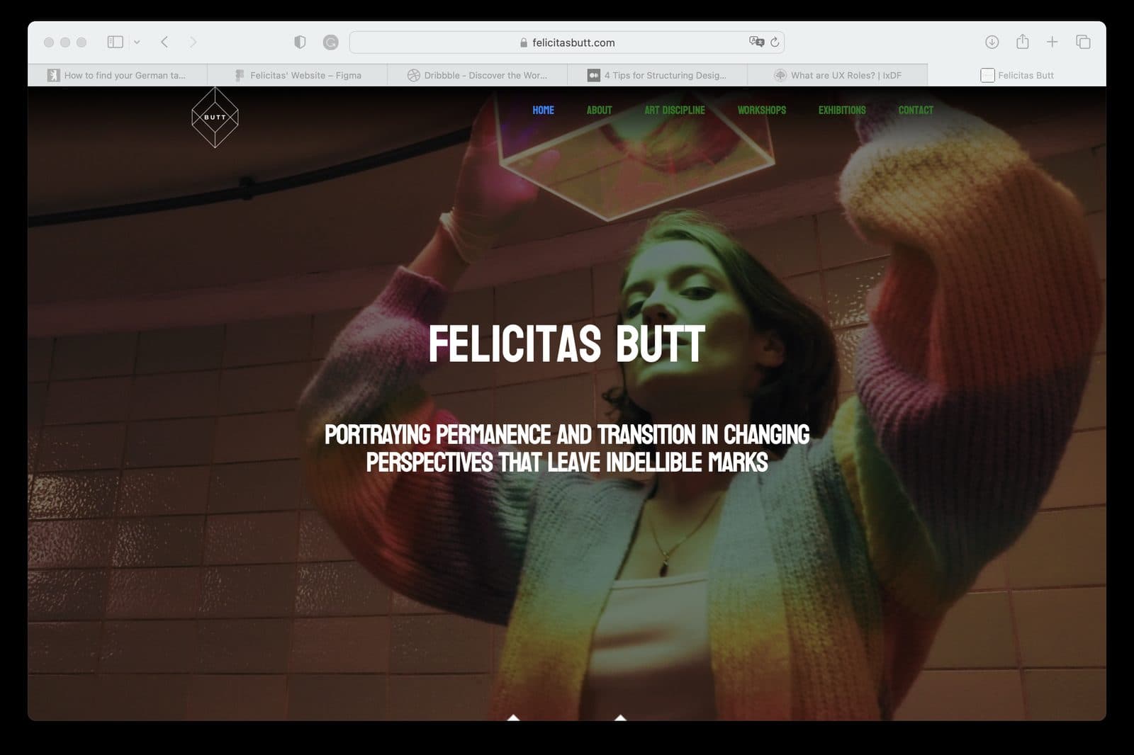
Her own line — portraying permanence and transition in changing perspectives that leave indelible marks — sits under the wordmark and sets the register before any work is seen.
The platform & who owns it
Webflow fits a solo practice: the design and the content live in one place, the running cost is predictable, and she publishes without a developer in the loop.
Collections are set up per art discipline rather than as one flat gallery, so a new discipline is a new collection rather than a rebuild.
The shop and the rentals were planned into the architecture before either existed, so adding them later is a page going live, not a restructure.
Exhibitions are a collection too, so a past show archives itself rather than being deleted — which is what a funding assessor wants to see.
The domain, the CMS and the content are hers. Nothing routes through us.
The design & what it does for the business
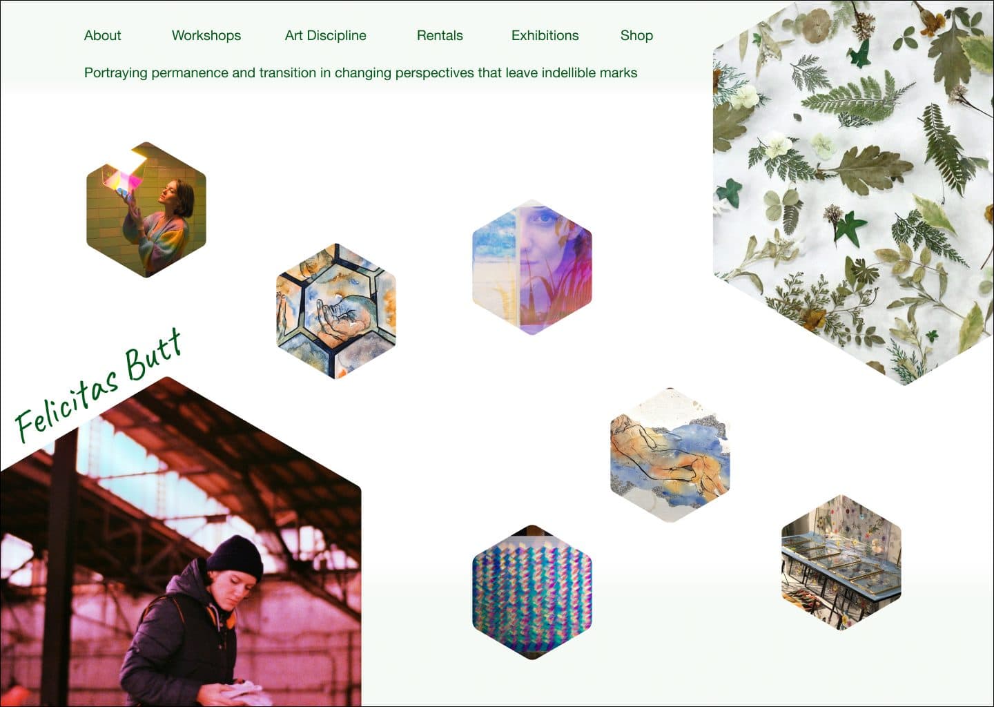
The first direction was light — a white ground with the artwork set in scattered hexagonal tiles. It was distinctive and it was wrong: the shapes cropped the work, and the ground competed with the colour in the paintings.
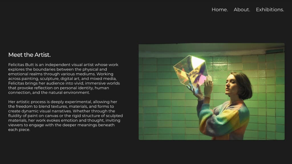
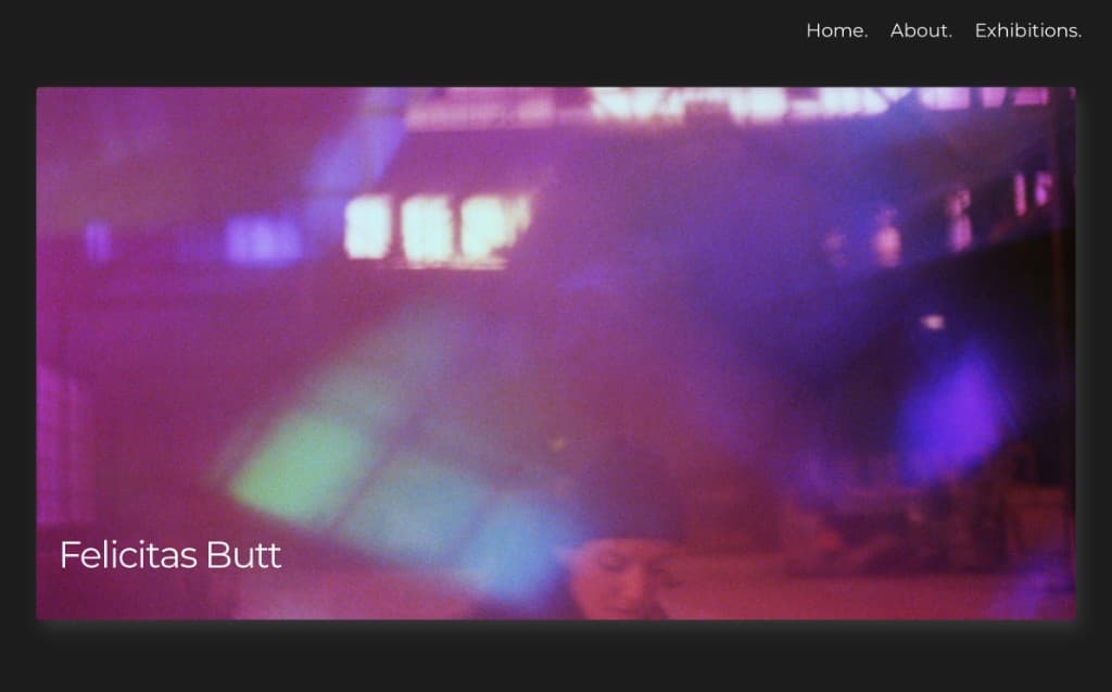
The direction that landed inverts it — a dark ground, the artwork uncropped, and given full weight in the hero. That was the brief we agreed on: her artwork leads, and the layout and graphic assets are built to complement it, not compete with it.
Type is deliberately quiet. One display face, restrained hierarchy, minimal chrome. The portfolio is the product and everything else gets out of its way.
Colour is left to the work. The interface runs close to greyscale so that a textile piece and a photograph can sit beside each other without the site picking a side between them.
Graphic assets were made with her rather than sourced around her, so the section imagery is her own material reworked for the web.
We designed in Figma and built from the approved prototype in Webflow — the same pair of hands across both, so nothing was lost between design and build.
Cadence
We reviewed at each stage, and I pushed back where a decision would have cost her independence later.
What Changed
Felicitas publishes without asking anyone. New work, new exhibitions and workshop listings go up on her schedule, which is the difference between a site that stays current and one that quietly goes stale.
The practice reads as one practice. A visitor moving from textile work to photography sees one consistent layout built to hold the work rather than compete with it — which was the whole problem, and it is what the dark ground and the uncropped artwork solve between them.
Enquiries increased and marketing reach broadened. The site also did the job it was partly built for: it supported applications for German public arts funding, where an independent artist has to prove a practice exists at the standard she claims for it.
Workshops, rentals and the shop have somewhere to live. They were built into the structure before they had traffic, so growing into them costs nothing structural.
And the frame holds. Adding a new discipline means adding a collection, not rethinking the site.
“The layout was built to complement the work — never to compete with it.”
Looking Back
We kept the information architecture deliberately lean. There was a case for building the shop and the rentals out in full at launch, and we chose room to grow over completeness — a smaller site she could run beat a larger one she would have needed help with. The relationship picks up when a new body of work needs a home, which is how it has gone since.